Incoming message
Table of contents
Overview
The chat partner(chatbot, agent) side messages.
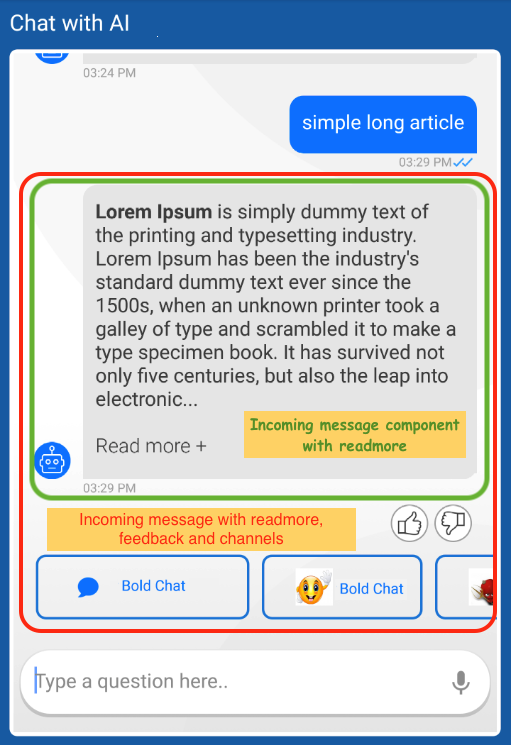
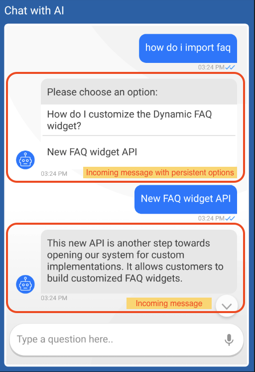
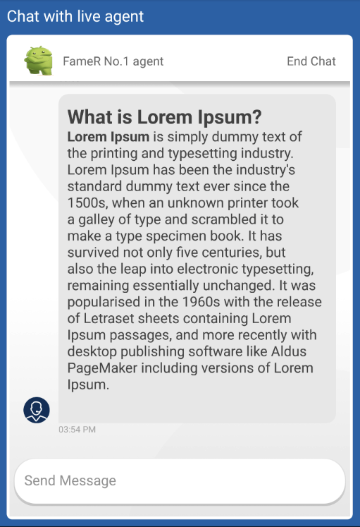
Displays textual and HTML formatted messages. The incoming message component also supports the display of avatar image and timestamp.
Chatbot messages may be constructed by multiple UI components, depends on the message content. The incoming message component contains the textual content of the message, persistent options, readmore. Other message properties such channels quick options and feedback, are displyed by separate components.
 |  |
|---|---|
 |
How to customize
The incoming message component supports all customization methods Customization options are defined by the configuration adapter ExtendedBubbleContentUIAdapter. The component implementation implements this adapter.
The configured customization will be applied to the component after it was created, and when it was binded with data.
Customizing SDKs implementation
ChatUIProvider(context).apply {
    chatElementsUIProvider.incomingUIProvider.apply {
        // on creation customization
        configure = { adapter: BubbleContentUIAdapter ->
                        adapter.apply {
                            setTextStyle(StyleConfig(14, Color.RED, Typeface.SANS_SERIF))
                            setBackground(ColorDrawable(Color.GRAY))
                            setAvatar(ContextCompat.getDrawable(context, R.drawable.avatar))
                        }
                    }

        // Dynamic customization on data update
        customize = { adapter: BubbleContentUIAdapter, element: IncomingElementModel? ->
                        element?.takeIf { it.elemScope.isLive }?.let {
                                adapter.apply {
                                    setAvatar(ContextCompat.getDrawable(context, R.drawable.agent))
                                    setTextStyle(StyleConfig(10, Color.WHITE))
                                    setBackground(ColorDrawable(Color.RED))
                                }
                            }
                        adapter
                    }
    }
}
Overriding default implementation
ChatUIProvider(context).apply {
    chatElementsUIProvider.outgoingUIProvider.apply {
        overrideFactory =
            object : IncomingElementUIProvider.IncomingBubbleFactory {

                // simple incoming message component - text, avatar, timestamp
                override fun createIncoming(context: Context): BubbleContentAdapter =
                                                                CustomIncomingView(context)

                // extended incoming message,
                // supports chatbot special message additions - persistent options, readmore
                override fun createExtendedIncoming(context: Context): ExtendedBubbleContentAdapter =
                                                                        CustomExtendedIncomingView(context)
            }
    }
}
Readmore component on long chatbot messages
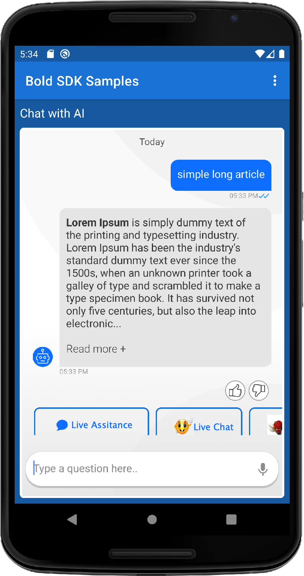
Chatbot messages content display has a length limit, called threshold. Messages that are longer than the configured threshold length, will be trimmed.
A readmore component will appear on the bottom of a trimmed message, leading to a full message view.
 | 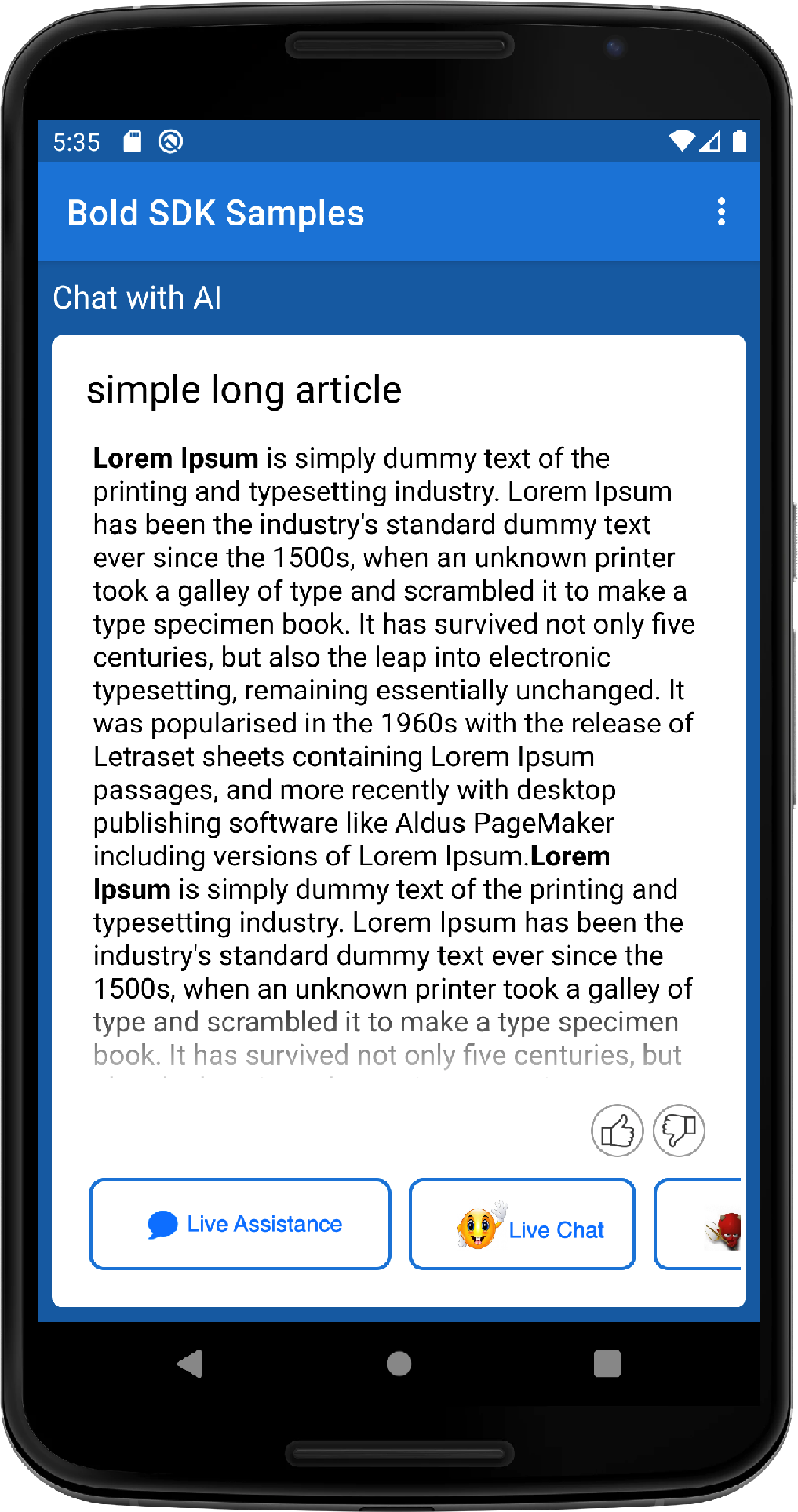 |
The readmore component supports configuration by adapter only. The configuration options are defined by ReadmoreAdapter.
In order to customize the readmore component display, access readmoreUIProvider from ChatUIProvider and override the configure method.
ChatUIProvider(context).apply {
    chatElementsUIProvider.incomingUIProvider
                            .readmoreUIProvider.configure = { adapter:ReadmoreAdapter ->
                                    adapter.apply {
                                        setReadmoreStyle(StyleConfig(16,
                                                                adapter.uiContext.resources.getColor(R.color.colorTextDark),
                                                                Typeface.create("sans-serif-light", Typeface.NORMAL)))
                                        alignReadmore(UiConfigurations.Alignment.AlignStart)
                                    }
                                }
}
readmorecomponent displayed text, can be customized, by overridingR.string.read_morestring resource.
Customizing chatbot message length display threshold
By default the threshold is configured to limit the text length to 320 characters.
The threshold can be configured to a value between 320 - 640.
In order to customize the chatbot messages displayed length, create a ConversationSettings object, and configure the new threshold. Pass the ConversationSettings object upon ChatController creation.
ChatController.Builder(context)
                .conversationSettings(ConversationSettings()
                                        .setReadMoreThreshold(400))