File Upload Work in progress
Table of contents
- Overview
- 2. Choose an upload provider
- Extra
- UI Customization
- picture_ico, default_ico, excel_ico, archive_ico
Overview
The SDK provides an upload mechanism, but enables you to use your own.
Follow the next steps to integrate upload functionality to your chat:
If you don’t use the SDK for chat ui creation, but want to use the provided uploader mechanism, go to step 2.
1. Define your file upload trigger
The UI component the user will use to trigger the upload.
-
Use SDK provided trigger
The SDK provides an upload trigger (attach icon) which will be positioned inside the input field. In order to be notified when the user had activated the trigger in order to do some uploads, you need to implement
onUploadFileRequestinChatEventListener.override fun onUploadFileRequest(){ // user wants to upload content to the agent }- Customize upload icon:
via
ChatInputUIProviderconfig object.val chatController = ChatController.Builder(this).apply { ... chatUIProvider(ChatUIProvider().apply{ chatInputUIProvider.uiConfig.uploadImage(...) }) ... } -
Use your own trigger
- Apply your own upload UI component.
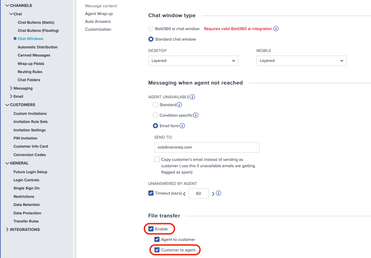
Insure that upload feature is enabled, before you display the UI to the user:chatController.isEnabled(ChatFeatures.FileUpload);Learn how to enable/disable file transfer on admin console here
-
Hide the SDKs upload icon:
val chatController = ChatController.Builder(this).apply {
    ...
    chatUIProvider(ChatUIProvider().apply{
        chatInputUIProvider.uiConfig.showUpload = false
    })
    ...
}
- Apply your own upload UI component.
2. Choose an upload provider
-
Use SDK’s provided uploader
-
Create a
FileUploadInfoobject, for every content you need to upload.//... user selected the file to upload val uploadInfo = FileUploadInfo().apply{ type = ... // as defined in @FileType name = ... // can differ from the actual file name filePath = ... // actual selected file path content = file.readBytes()... // if was not provided on the constructor } -
Activate the upload:
-
When using the ChatController
 chatController.uploadFile(uploadInfo) { uploadResults ->
     //.... got UploadResults and do whatever
     uploadsResults.error?.run{
         Log.e(TAG, "Got an error on ${uploadResults.data.name}
                             file upload: ${uploadsResults.error}")
         ...
     }
 }
Upload results are passed over the provided callback.
-
When using the Uploader
 BoldLiveUploader().upload(uploadInfo, AccountDetails(...)) { uploadResults ->
     //.... got UploadResults and do whatever
     uploadsResults.error?.run{
         Log.e(TAG, "Got an error on ${uploadResults.data.name}
                             file upload: ${uploadsResults.error}")
         ...
     }
 }
-
-
-
Use your own uploader
- When user triggers an upload and chooses the content to be uploaded, upload that content with your uploader.
-
Pass an UploadEvent to the
chatControllerwith the upload results, in order to have the upload bubble in the chat.MyUploader.upload(...){ //.... do upload stuff // pass results to the SDK val uploadResults = UploadResults(FileUploadInfo?, NRError?) chatController.handleEvent(Upload, new UploadEvent(uploadResult)); }
Extra
Listening to upload notifications
One can listen to files upload events via the ChatController, by registering to the available uploads notifications he needs.
chatController.subscribeNotifications(notifiableImpl:Notifiable,
                    Notifications.UploadEnd, Notifications.UploadStart,
                    Notifications.UploadProgress, Notifications.UploadFailed)

// Notifiable implementation (notifiableImpl):
{
    ...

    override fun onNotify(notification: Notification, dispatcher: DispatchContinuation) {

        when (notification.notification) {
            Notifications.UploadStart,
            Notifications.UploadEnd,
            Notifications.UploadFailed -> {
                (notification as UploadNotification).apply {
                    // uploadInfo:FileUploadInfo member is available
                    ...
                }
            }

            Notifications.UploadProgress -> {
                (notification as ProgressNotification).apply {
                    // uploadInfo:FileUploadInfo member is available
                    // progress:Int member is also available
                    ...
                }
            }
        }
    }
}
UI Customization
-
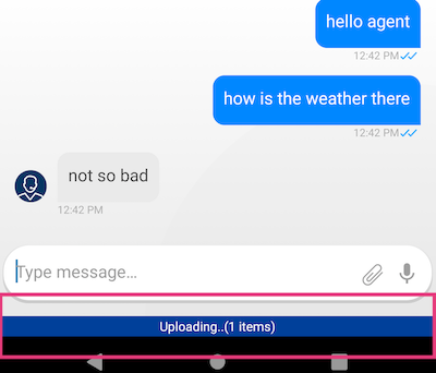
Customizing uploads progress indication
The SDK provides uploads propress indication bar
-
The uploads bar can customized via
ChatUIProvider.uploadsCmpUIProvider.configure.// display uploads summary bar as floating component chatUIProvider.uploadsCmpUIProvider.configure = { adapter:UploadsCmpAdapter-> adapter.apply { ... } } - The uploads bar can be overrided with your own implementation, via
ChatUIProvider.uploadsCmpUIProvider.overrideFactorychatUIProvider.uploadsCmpUIProvider.overrideFactory = object: UploadsbarCmpUIProvider.UploadFactory { override fun create(context: Context): UploadsCmpAdapter { return .... // create customed component } } -
In order to notify the SDK that the component done with the uploads display and should be removed, pass
CmpEventto theChatController:chatController.handleEvent(CmpEvent.EventName, CmpEvent(ComponentType.UploadsStripCmp, CmpEvent.Idle))Customizations that were configured with
UploadsCmpUIProvider.configurewill be applied on your customed component as well.
-
-
Customizing upload outgoing bubble
Same as regular outgoing bubble customizations.