Outgoing message
Table of contents
Overview
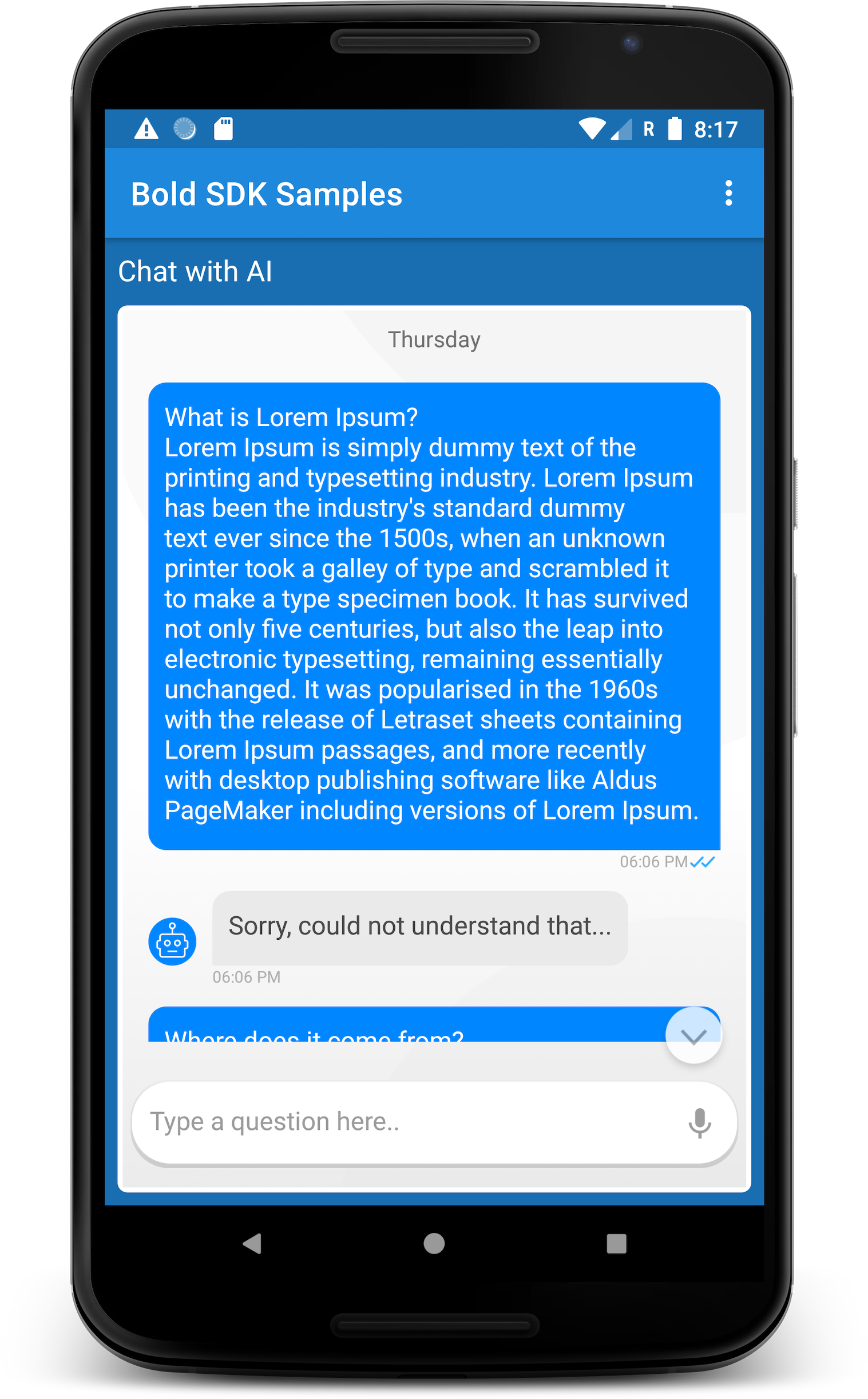
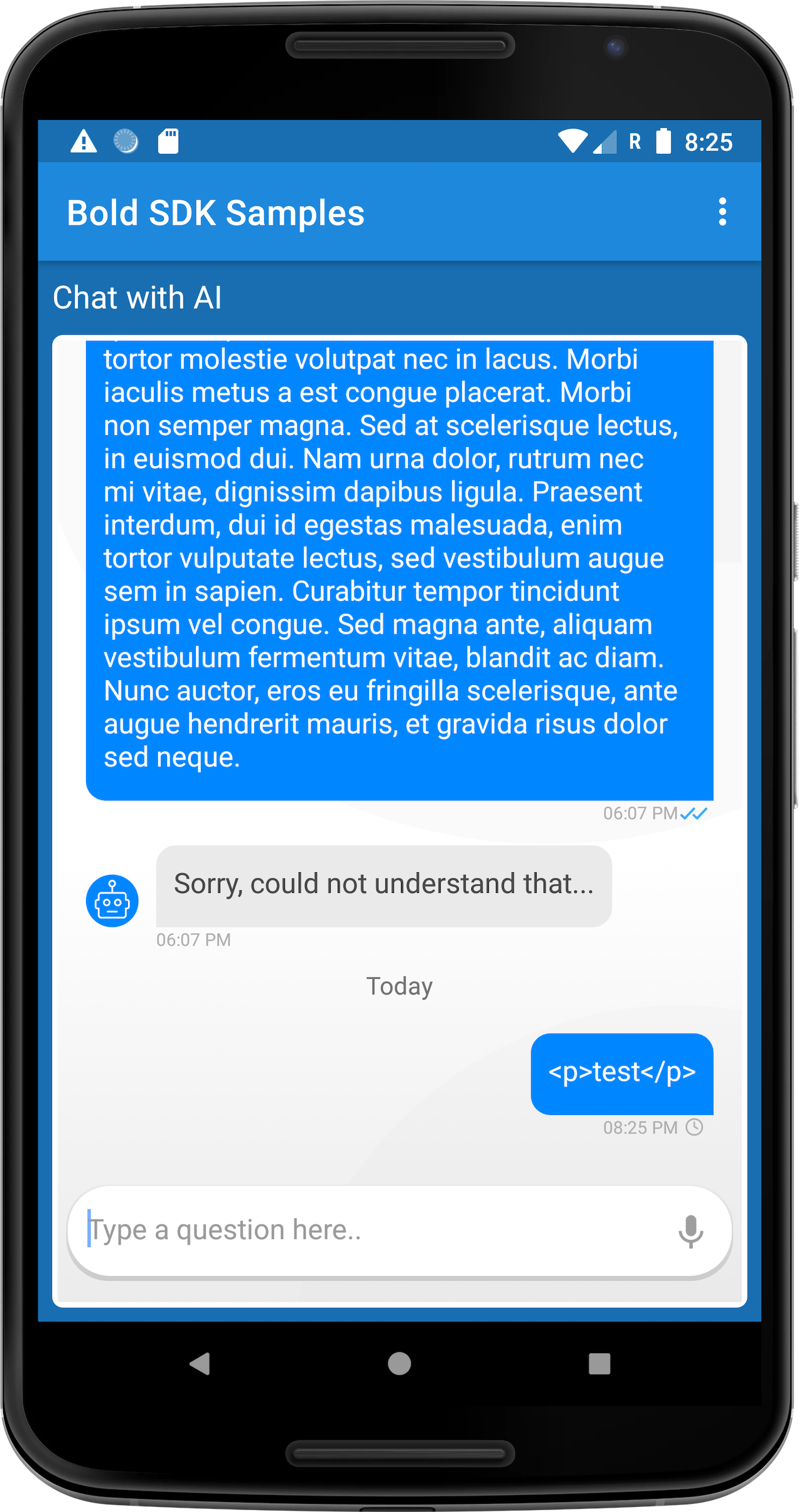
The display of user side messages.
Displays textual content only.
Html formed message will be displayed with all HTML tags. The message content can be, a typed user input, autocomplete suggestion selection, selected option or channel. The outgoing message component also supports the display of avatar image(not by default), timestamp and message send status. The message has no length limitation.
 |  |
|---|---|
How to customize
The outgoing message component supports all customization methods Customization options are defined by the configuration adapter BubbleContentUIAdapter. The component implementation implements this adapter.
The configured customization will be applied to the component after it was created, and when it was binded with data.
Customizing SDKs implementation
ChatUIProvider(context).apply {
    chatElementsUIProvider.outgoingUIProvider.apply {
        // on creation customization
        configure = { adapter: BubbleContentUIAdapter ->
                        adapter.apply {
                            setTextStyle(StyleConfig(14, Color.LTGRAY, Typeface.SANS_SERIF))
                            setTimestampStyle(TimestampStyle("hh:mm aa", 10, Color.parseColor("#aeaeae")))
                            setBackground(ContextCompat.getDrawable(uiContext, R.drawable.outgoing))

                        }
                    }

        // Dynamic customization on data update
        customize = { adapter: BubbleContentUIAdapter, element: OutgoingElementModel? ->
                        element?.takeIf { it.elemScope.isLive }?.let {
                                adapter.apply {
                                    setTextStyle(StyleConfig(10, Color.WHITE))
                                    setBackground(ColorDrawable(Color.BLUE))
                                }
                            }
                        adapter
                    }
    }
}
Overriding default implementation
ChatUIProvider(context).apply {
    chatElementsUIProvider.outgoingUIProvider.apply {
        overrideFactory =
            object : OutgoingElementUIProvider.OutgoingFactory {
                // Creates an outgoing message component - text, timestamp, status
                override fun createOutgoing(context: Context): BubbleContentAdapter =
                                                                CustomOutgoingView(context)
            }
    }
}
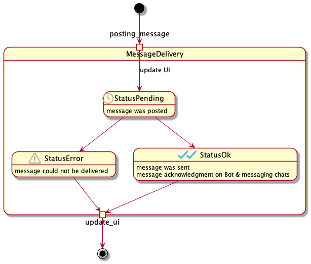
Message delivery status
When the user sends a message, the message goes through a cycle of states.
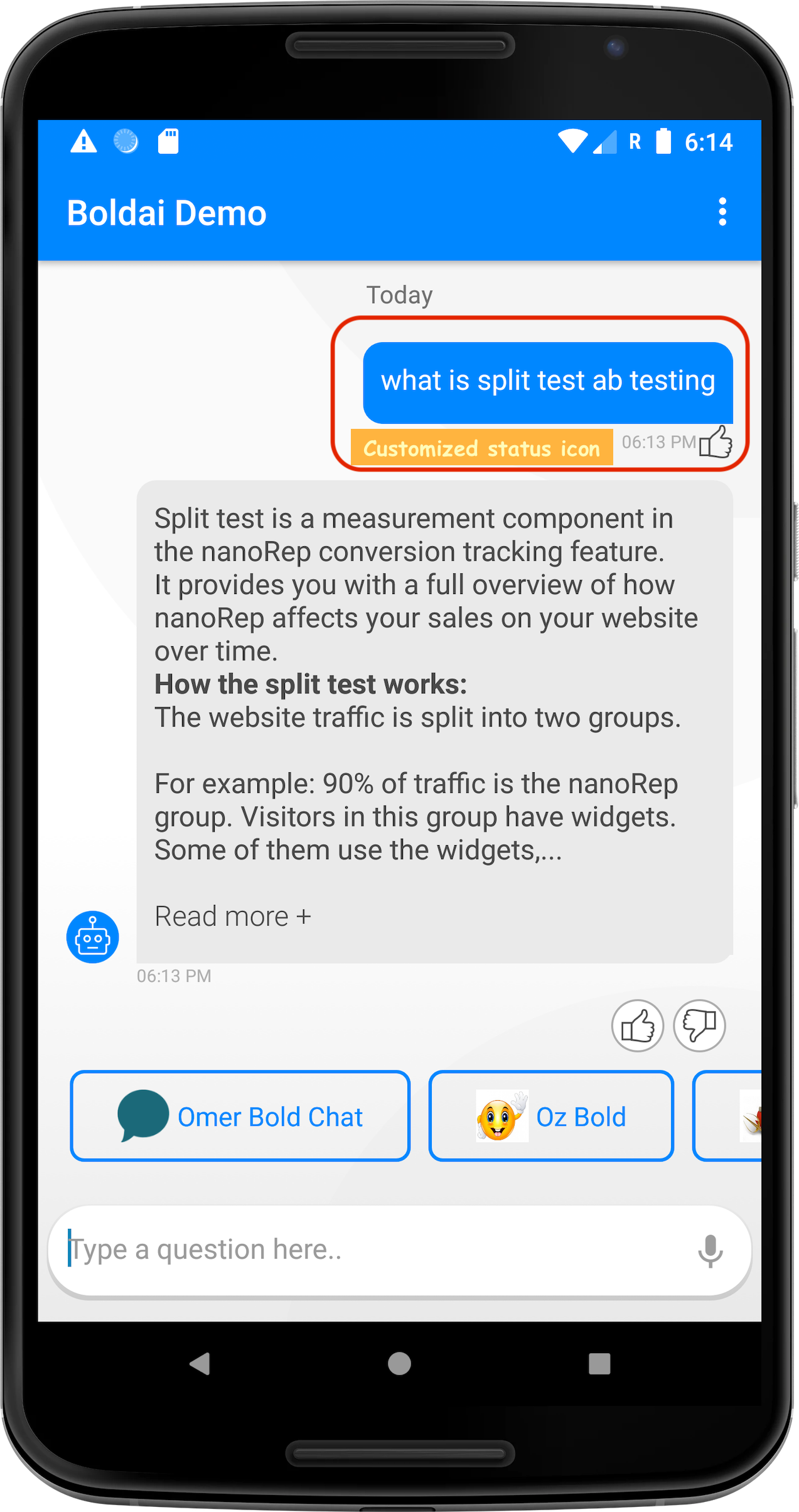
Customize message Status icons
The message status icons are configurable. Icons configuration can be done
// option 1 : declare icons config object
val iconsConfig = StatusIconConfig().apply {
                     iconOk = ContextCompat.getDrawable(context, R.drawable.feedback_positive_icon)
                     iconPending = ContextCompat.getDrawable(context, R.drawable.feedback_negative_icon)
                 }
// option 2 : declare icons config style
<style name="demo_chat_status_icon_style" partent="chat_textview_status_icon_style">
    <item name="chat_status_ok">@drawable/feedback_positive_icon</item>
    <item name="chat_status_pending">@drawable/feedback_negative_icon</item>
</style>
ChatUIProvider(context).apply {
        chatElementsUIProvider.outgoingUIProvider.configure =  { adapter ->
            adapter.apply{
                // set a config object
                setStatusIconConfig(iconsConfig)
                // OR: set a style resource
                setStatusIconConfig(R.style.demo_chat_status_icon_style)

                setStatusMargins(2,0,0,0)
            }
        }
}