Carousel
Table of contents
Overview
Displays a “carousel” typed incoming response. As a regular incoming message, carousel has a message section with a timestamp and avatar, and the quick options and channels at the bottom. The carousel provides the ability to display multiple related answers to a user query in a horizontal scrollable structure.
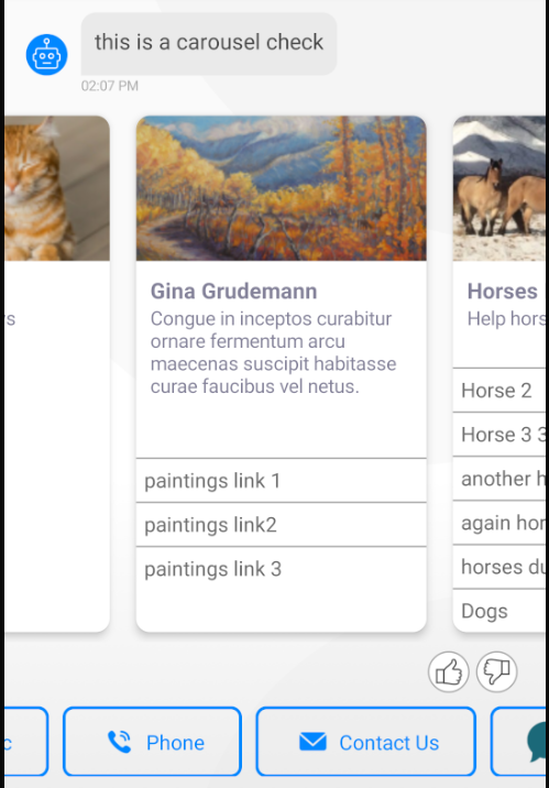
Carousel Item
Each corousel item consists of three display sections:
- ImageOptional - Can be configured with a url link, on the admin console. If image was not set, a default image will be displayed.
- InfoMandatory - Consist of a Title and an optional subtitle
- OptionsOptional - Item options .
UI configurations
The carousel UI can be customized, by overriding the CarouselItemsUIProvider.configure method and/or the CarouselItemsUIProvider.customize method for dynamic data related customizations.
The available configuration proprties can be found in CarouselItemsUIAdapter.
General item configurations
- Use
CarouselItemsUIAdapter.setCardStylemethod to configure the carousel item display.elevationlevel - level of 0, makes a flat look, while greater values sets a card look to the items.- Rounded corners - defined by a radius level. Value of 0 makes squere corners.
Notice, If a card style display is configured, items background should not be transparent!
-
Carousel items consist of 3 display sections: info, image and options. The sections display order, can be configured with
CarouselItemsUIAdapter.setInfoTextAlignment, defaults toCarouselItemConfiguration.ItemInfoAlignment.AlignBelowThumb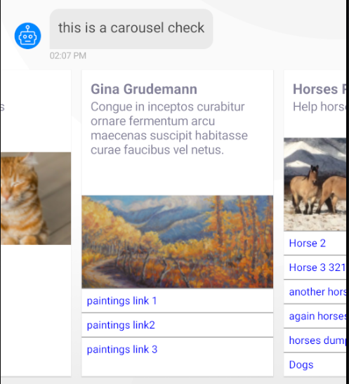
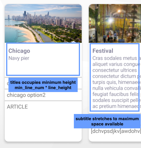
Info section
Info section contains a title and a sub-title, which are configured with minimum line number of 1 and 2 lines respectfully.
Minimum line number can be configured with setInfoTitleMinLines and setInfoSubTitleMinLines methods. The minimun height for this section will be calulated according to the line number values.
The sub-title height is flexible and may stretch to the maximum available item height.
ChatUIProvider(context).apply {
    chatElementsUIProvider.incomingUIProvider.carouselUIProvider.configure = { adapter ->
        adapter.apply {
            setInfoSubTitleMinLines(4) // set minimum sub title size to 4 lines hight
            setInfoTitleMinLines(3) // set minimum title size to 3 lines hight
        }
    }
}
Additional info section configurations can be found in
CarouselItemsUIAdapter. See methods prefixed withsetInfo.
Options section
Item options are contained in a non-scrollable vertical order layout.
The options, text alignment and look are configurable.
All options are configured to the same line count, defaults to 1 line.
Use CarouselItemsContainer.setOptionsLineCount method to change the line count.
Carousel view height is being calculated according to the item with the maximum number of options.
Image section
Image size is constant. If a link is configured for the image, it will be passed to the hosting App, on user press action, for further handling, via ChatEventListener.onUrlLinkSelected implementation.
UI override
Carousel list section can be override by overriding CarouselItemsUIProvider.overrideFactory property.
A customed implementation of CarouselItemsAdapter should be provided by the overriding factory.
ChatUIProvider(context).apply {
    this.chatElementsUIProvider.incomingUIProvider.carouselUIProvider.overrideFactory =
            object : CarouselItemsUIProvider.CarouselFactory {
                override fun createItemsAdapter(context: Context): CarouselItemsAdapter {
                    return MyCarouselImplementation();
                }
    }
}