Instant Feedback(Feedback Per Article) Work in progress
Table of contents
Overview
Response specific feedback, provides the tool to review specific content quality and relevancy.
When enabled, every AI response will be followed with a feedback UI element, as long as it valid for feedback submission.
Instant feedback Configurations
The feedback UI component is configurable, by bold360ai console configurations, and by SDK defined costomizations.
Admin console configurations
- Feature availability
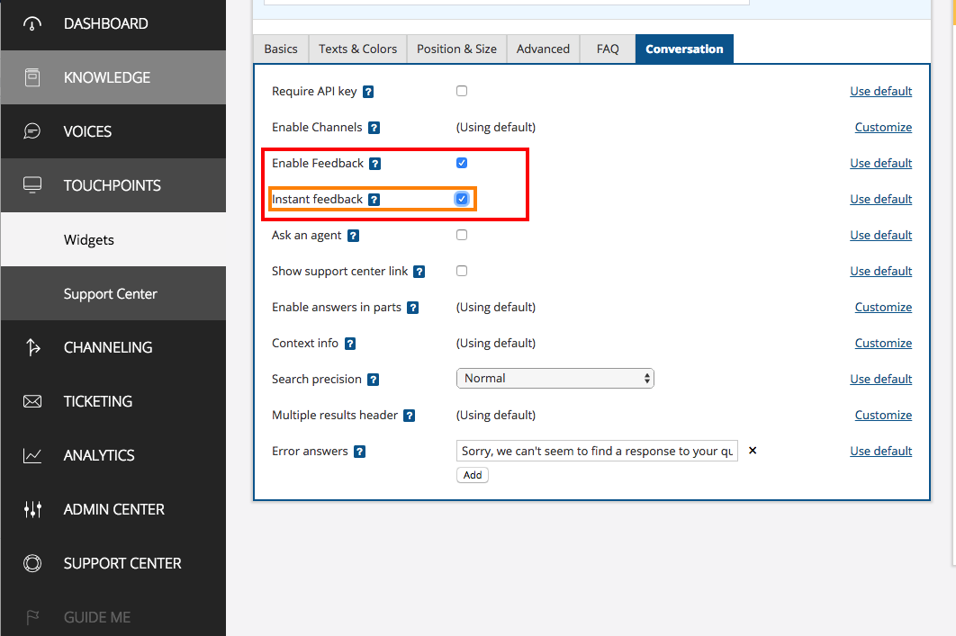
Feedback feature can be truned on/off on the admin console per widget specific configurations to your account and knowledge base.
Feedback status settings
- Feedback display type
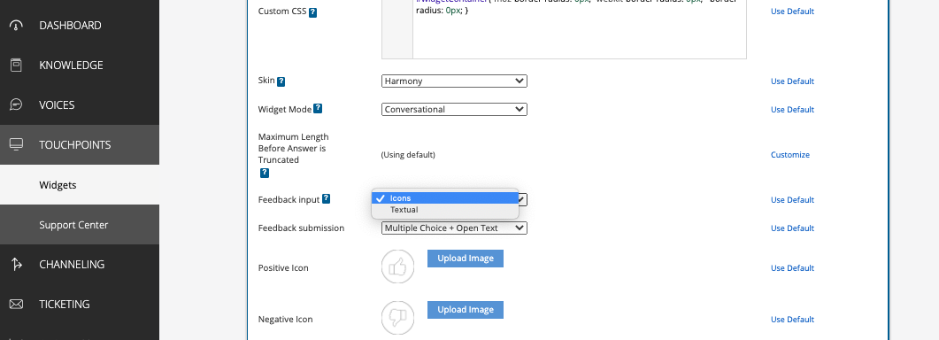
There are 2 predefined display options for the feedback component, that can be selected on the admin console, textual and iconic.
Feedback display type settings
The Bold SDK provides default implementations for both types.
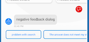
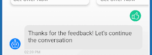
Iconic feedback:

Textual feedback:
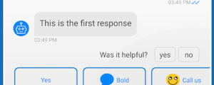
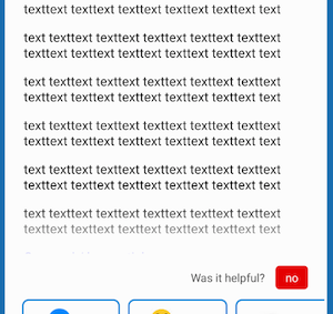
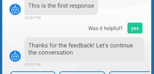
-
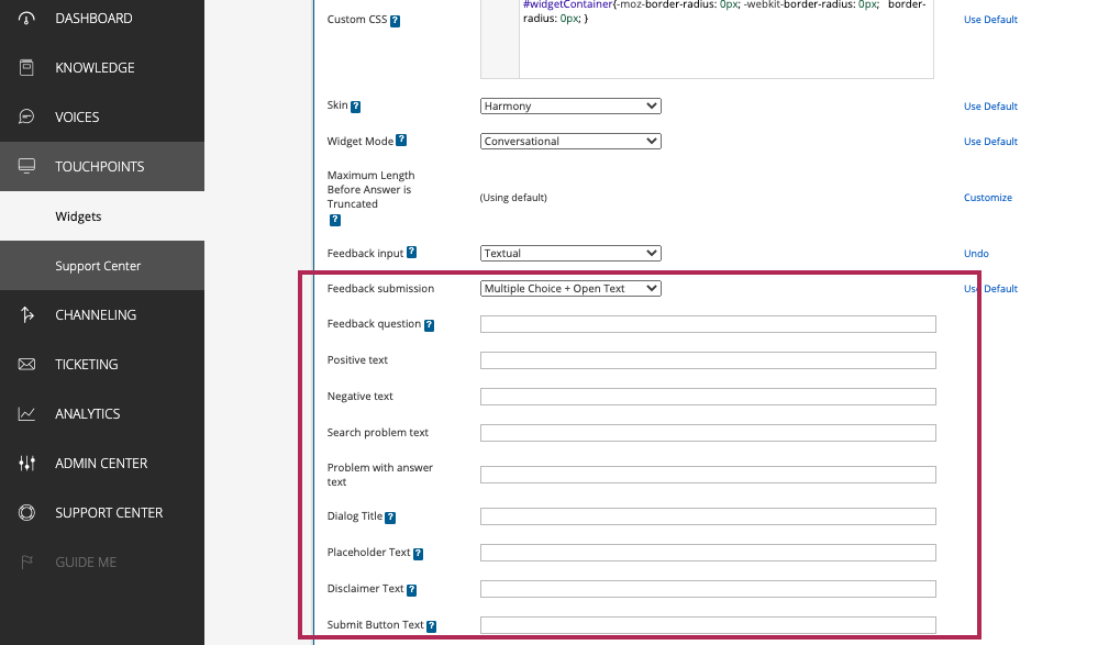
Textual configurations On the admin console you can configure the messages content that are presented to the user over feedback flow.
SDK configurations
Using the SDKs internal UI implementation is not configurable. We provide the option to integrate a custom feedback UI implementation which will override the internal SDKs implementation.
📚 How to change internal feedback icons
This can be done by overriding the icons drawable resources by the hosting application. Override the following drawables:
- feedback_negative_icon
- feedback_negative_selected_icon
- feedback_positive_icon
- feedback_positive_selected_icon
Custom Feedback UI
- Create your custom feedback view. Make it implement
FeedbackUIAdapterinterface.class CustomIconFeedbackView : LineaLayout, FeedbackUIAdapter { ... } class CustomTextFeedbackView : LineaLayout, FeedbackUIAdapter { ... } - Create implementation for
FeedbackFactory, that creates your custom feedback view.class MyCustomFeedbackFactory : FeedbackFactory{ override fun create(context: Context, feedbackDisplayType: Int): FeedbackUIAdapter { return when (feedbackDisplayType) { IconicFeedback -> CustomIconFeedbackView(context) else -> CustomTextFeedbackView(context) } } } - Set feedback provider factory to point to your implementation, in the
ChatUIProvider.val chatUIProvider = ChatUIProvider().apply{ chatElementsUIProvider.incomingUIProvider.feedbackUIProvider.overrideFactory = MyCustomFeedbackFactory } val chatController = ChatController.Builder(context).apply { chatUIProvider(chatUIProvider) .... }.build(account...)
Accessibility support
Feedback buttons are read to the user when the accessibility service is turned on.
The feedback texts are configured to the accessibility read as defined in the admin console for the positive and negative feedback texts. If feedback texts were not configured on the admin console, the SDK’s string resources will be used as defined on R.string.instant_feedback_no for negative and R.string.instant_feedback_yes for positive.
When a feedback type is selected by the user, some messages and actions will be available to the user, depends on his selection. The messages and optional actions are handled by the accessibility service as other messages in the chat.